Sunday, 15 April 2012

Task 11: Elements of game design, part four: environment

The environment is just as important as the characters within a game, without it we'd have nothing to do, no where to go or explore and there wouldn't be a game. When an environment is done well it is often overlooked, given the amount of time and effort that is put into it it is unfortunate, but it does mean the environment has been done well.
An interesting looking environment


While playing a game players don't often stop to admire or study parts of the environment unless something has stood out to them, this means it has either been so beautifully it is attention grabbing, or, more likely, it has been poorly and detracts from the believability of the game. In general if the environment is believable it won't stand out and will go undetected, comfortably making the world believable and interesting.

The environment is therefore key to if we really believe the games world or if it stands out to us as wrong. Games have in the past gone both ways on the scale. An example of good environment design is the Bioshock series. The  first game is based in the underwater city of Rapture set in the 1960s, the city is left in disarray following a social collapse and a war taking place. You enter the environment through a dramatic decent to the city via a bathysphere. When you get to Rapture the environment is instantly eye catching and stunning. The environment designers on the game did an amazing job of bringing in elements and styles of the 1960s into futuristic ideas and setting. You believe the environment is possible for the time and everything found within is also believable and in keeping.

Rapture's setting


The feel of Bioshock is fantastic with the environment and characters really lending to the games enjoyability, there is nothing within Bioshock that stands out as wrong or out of place. Every aspect of the game has been developed and planned to lend itself to Bioshock's story and the events that have taken place. We never get to actually see what happened to Rapture before we got there so the story is told and understood through what we see in the environment, and it works!

A scene inside Bioshock, easily readable.


A game that's environment didn't work so well was Stalker. Despite knowing what happened in the game and why the environment had gotten to its current state it just wasn't as believable or enjoyable. The game often felt too large and empty given the way it is played and was later modded to improve that. I found the characters and environment dull, atmospheric and uninteresting. I found myself having to apply alot of user made mods to the game in order to make it playable, which shouldn't be necessary.

Stalker looking abit bland and boring.


From what I have read and experienced some general guidelines for environment design would be;
  1. the environment should guide the player, creating meaningful play
  2. the environment should communicate the purpose of an area
  3. the environment should  set a believable scene
  4. the environment should tell the story of the game so the player can understand and assume what has happened without needing to be shown or told
  5. the environment needs to be interesting and believable and hint to a larger world outside of what the player sees
  6. the environment should be immerse and avoid things that would disconnect the player from the game


Task 10: Elements of game design, part three: character

Character design isn't something I really think about, this is mainly because the games I tend to play don't rely on good character design to be fun.These are games such as real time strategies and action adventure games. I think the game type I play most however is the first person shooter genre.

While characters are an important part of games they are often over looked in the genres I play, especially first person shooters, meaning there aren't very many characters that have stood out to me as memorable over recent years.

I can't see me.
 I think this is mainly due to the fact that you never see the character you play in first person shooters, they don't often talk or interact with the environment so they don't need to be designed or interesting. They are just a shell for the player and we're what gives them character. First person shooter games are often based around 'running and gunning' gameplay which doesn't give much chance or need for interaction with the environment so we never get to see how or feel how our character is relating or fitting into the world. I often find other characters within first person shooters to be some what dull and uninteresting if not unbelievable, they don't normally have a real sense of depth, this may be due to the fact you don't tend to spend any real length of time around other characters during gameplay and they aren't really necessary within the game.

Despite the fact first person shooters tend not to have awesome character design, I still find them enjoyable and fun to play, because the characters don't really make or break the game and you never need a real sense of attachment to any of them in order to enjoy the game.

Other game genres however, such as role playing games, need to have more believable characters that have good design because the way they look, act and interact with us makes more of a difference. Within these games the character we play also has much more design gone into them as the way we connect to them becomes an important part of how much we enjoy the game. Games that are played within the 3rd person perspective also tend to have alot more effort put into the way our characters look, feel and move as we can see every move they make and if it doesn't look realistic we wont believe it and ultimately dislike it.

Cloud


Character design then is an important part of making a game believable and fun. The challenge is to make characters that are realistic and believable within their given environment and setting of the game. Character design relates to everything about a character, their history, accent, movement, facial expressions and the way they dress. Everything must work together believably in order for the character to make sense and fit within the world so that they don't stand out as wrong.

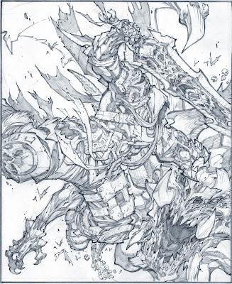
While some games require characters to be deeply developed to fit, others work well due to strong art design. One of my favourite game characters of all time is 'War' from the game 'Darksiders'. This isn't because his character has a deep back history, emotional connection or sense of humour, its because he looks bad ass.

He looks awesome!


I'm instantly drawn to the Darksiders game and the characters within it because the artistic style of the game is awesome. The way the world and characters are designed isn't realistic but it is all believable in relation to each other which creates a fun game experience. The Darksider's style makes everything within the game bulky, bold and huge, if they had stuck a weedy main character into it like Link, the game would be rubbish. It works because no matter how big the world is or how nasty and huge the enemies are, War looks and feels like he can take it all on, despite being smaller, and that's down to his design. War isn't very deeply designed and he doesn't have a real emotional background but that is also part of his design, we don't really relate to him as a character but he is believable within the Darksiders world and that's why he works.

And he fits!


I think an important part of character design is relating them to the genre and world they are from. There is no point in creating an emotionally deep soldier for an FPS unless it is the point of the game because it would be unnecessary, overlooked and it just wouldn't fit. But it would be equally as bad to find a poorly designed shell of a character in an RPG that we just cant connect to. Characters are an important part of games that help to fill the world within a game and make it believable, but how they are designed needs to work with the game itself. 
Monday, 19 March 2012

Self Portrait

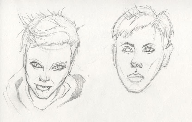
When I did my self portraits I decided to do them in the style I always used to draw in and one that I find more comfortable doing.
I've always found comic book styles interesting and inspiring and I've practised drawing in them more than any others. When I was growing up I would always copy images that I liked from comic books so its a style I'm used to and enjoy doing. Before coming on this course being a comic book artist has always been something I think I would of really enjoyed doing.


Portrait practise.


Since coming on the course I've pushed myself to draw more realistically and from life instead of photographs as much as possible. It has been quite difficult for me at times and when I get most stressed out at drawing I tend to revert to my comic book style.

I feel much more confident in my ability to draw in a come book style rather than a realistic one which impacts the strength of my drawings.
(left) comic book style, (right) drawn from life
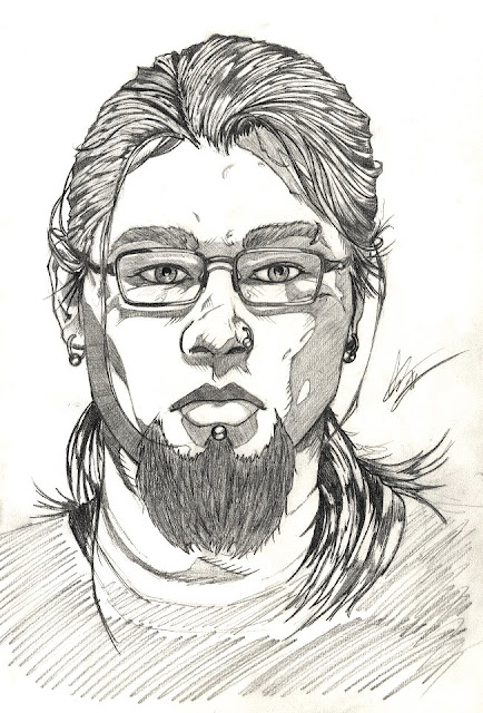
For my final piece I wanted to draw from life properly using a mirror, rather than a photograph, I think this gets me to concentrate more on what I'm doing and produce a better image. I took me around 8-9 hours to do and I'm pleased with the outcome. I made the decision to use my comic book style to draw the image rather than trying to do a more realistic one. I think the style works well, with solid pencil markings and my confidence in using the style shows.

Self portrait final

Saturday, 11 February 2012

Elements of game design, part two: art direction for games

When I think of 'art director' I think of someone who does just that, they direct the way something looks, flows and feels artistically, whether it be a video game or a film. During our last critical studies group we watched some of the development interviews from Black Hawk down and I found them really interesting. I have always really liked Ridley Scott's work and the films he works on but haven't always understood exactly why I enjoy them so much. Learning more about him through interviews with people hes worked with was eye opening. I think an important part about being an art director is having strong roots in art yourself and being able to visualise and then communicate this well and I think this is something Ridley Scott can do.
Due to his artistic background he has a fantastic understanding of light and how to use it in his films to give the most effect and feeling. People find him much better to work with because he can communicate his creative vision through drawings, something other art directors might not be able to do.


Ridley Scott

I know there is more to being an art director than I realised, so I looked for what exactly you need to do to be one in the games industry today. This is a job listing at one of EA's studios -

EA LOGO

Art Director - Gothenburg
The Art Director is responsible for the visual style and quality of all assets created by the team. This includes in-game and front-end menu assets, web sites and branding.
Responsible for the initial high concepts behind visual style, the Art Director communicates their vision by creating key drawings, concept images, mood boards, colour swatches, documentation and example assets.
The Art Director works with the project’s Senior Producer to ensure the art direction fits with the overall project goals and they also work closely with the team’s game and web artists to realise this vision.
Given this is a small, nimble team with a start up mentality, the Art Director needs to be ready to get their hands dirty by also contributing to the production of game, menu and web assets.
You will also be actively involved in hiring new art staff into the team, as well as liaising with contractors and outsourcing groups.

You have a deep understanding of several 2D and 3D software packages. An advanced understanding of motion principles and/or training in areas such as classical animation. During your 3+ years of professional experience you have been responsible for leading and inspiring art production teams. To join our team, you must demonstrate solid communication and problem solving abilities. You must be strategic, as well as have an eye for detail and commitment to deadlines, delivering high quality art on time and on budget.

Experience and Qualifications
• Prior games industry experience or film/television production, or on line experience are each a major plus
• Prior experience as Art Director or Lead artist is preferable
• Solid understanding of art and development practises
• Broad interest in aspects of visual art outside of video and computer games

Demo reel requirements
• Conceptual communication
• Composition
• Colour
• Light
• Motion
• Front End and Typography
• Presentation skills
• Craftsmanship
• Breadth of creative styles.

Jonathan Jacques-BelletĂȘte,
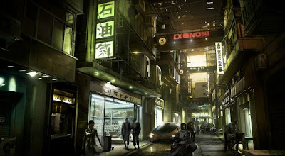
Art Director for Deus Ex: Human Revolution
Wow. Although its great to set your sights high, being an art director seems beyond me right now. I might well get there at some point but given what they have to do I'm not sure I'd ever want to! The art director is responsible for the visual style and quality of all assets created by the team, this includes in-game and front-end menu assets, web sites and branding. That seems like alot of responsibility and not something I'm sure I'd ever want to take on. The art director is tasked with visualising and communicating an idea and then bringing together everything that is produced to unify the vision. The art director is in charge of the overall visual appearance and how it communicates visually, stimulates moods, contrasts features, and psychologically appeals to a target audience. In smaller development groups the art director is also tasked with producing artwork or 3D assets along with everything else so they need to have a good working understanding of both 3D and 2D. Art directors, in short then, are very talented people! They require a huge amount of vision and knowledge and the ability to lead and inspire other people, with years of experience in the industry.


An interview with the art director behind Deus Ex: Human Revolution!
http://playstationlifestyle.net/2011/08/18/psls-presents-jonathan-jacques-belletete-art-director-for-deus-ex-human-revolution/

Tuesday, 31 January 2012

Game Review : Deus Ex Human Revolution


I played the first Deus Ex many years ago when it first game out but have never actually got round to finishing it, despite this however I looked forward to it's prequel 'Human Revolution' since it's announcement. There is something about the artistic style, gameplay and theme of the game that got me really interested and excited about it. The guy just looks bad ass.

Deus Ex: Human Revolution is a science fiction based action role-playing game. Developed by Eidos Montreal, published by Square Enix and released in August 2011. It is the third game in the Deus Ex series, and a prequel to the original game released in 2000.

The game is set in 2027, 25 years before the first game and follows Adam Jensen, the director of in-house security for a biotechnology firm specialising in human cybernetic enhancement, Sarif Industries. After an industrial terrorist sabotage at Sarif's head quaters Jensen is mortally wounded and forced to undergo radical life-saving surgeries that replace large areas of his body with advanced prostheses. Upon returning to work, he becomes involved in the global politics of the human enhancement movement in the search for those responsible for the attack. The story from then on really drew me in and kept my attention, there are many different twists in the story that keep it interesting and fun. I don't normally get into games over their story but Deus Ex : Human Revolution was great.

Another thing that really made Human Revolution stand out for me was the different "pillars of gameplay", as called by the developers. You can choose how you want to play the game with choices like combat, stealth, hacking and social methods. You can switch between these gameplay types whenever you please with and types  flowing well into each other creating dynamic and fun gameplay.

In the series, Augmentations are technological modifications to the body that allow the user to use superhuman abilities. While augmentations in the first two games were nanotech, Human Revolution is set prior to both and instead features mechanical augmentations. These Augmentations cater to each of the four gameplay types and enhance the your performance in each of the gameplay types, allowing  you to craft your own method of play that you prefer. For example, you can choose to priority augmentations that either improve your character's combat prowess or his hacking abilities.

Unlike in Invisible War, weapons will fire distinct ammunition types instead of depleting a unified pool. They can also be upgraded like in Deus Ex via a variety of so-called "weapon mods" to improve their performance, such as reducing the time it takes to reload, increasing magazine size, adding a laser targeting device for increased accuracy etc.
Another change in Human Revolution is the use of regenerating health. I don't normally like the use of regenerating health in modern games but the change was made because the developers did not want players to get into a situation where they were unable to progress due to low health, and would be forced to "scrounge for med packs" and food. This scrounging behaviour would break the flow of the game when you had to search an entire level for medical supplies.


Perhaps though the biggest draw of the game for me was the overall feel and style of it. The game has a very strong visual style, one that appeals greatly to me.With good gameplay, an interesting story, awesome augmentations and a cool visual style the game was a definite hit for me and I enjoyed every minute.

The guy is awesomesauce and yes I own this.

Making a time table

I sometimes struggle during the week with getting work done and putting the hours in. A break can turn into a few hours of not getting any work done. To help me stick to a better routine I made myself a time table to stick to.


The classes of 3D, 2D, life drawing and critical studies are already in and the rest of the time I want to be working is simply labelled 'work'. I have done it this way rather than specifically labelling what I want to do every hour is because I know I'm less likely to stick to it. I might not feel like doing 3D or I might have already finished it, so if I just label it as an hour of work, it can be anything I need to do. I often work till very late every night anyway but don't feel like I use the time properly because it is often very stop - start. I'm hoping sticking to a time table will help me use my time more effectively and get more work done.

Monday, 30 January 2012

Elements of game design, part one: from Pong to next-gen…

The first thing that comes to mind when I think about 'game design' is ideas. Followed by story, characters, environments, settings, time and how the game plays. I think theres a lot involved in designing and then creating a game.


Its the job of game designers to think up games and the world they are set in and how you as the player experience it. When an idea for a game is created game designers have to think of everything about anything involved. They envision the main characters, side characters, quests, story, drive, impact, sound, style, flow and everything in between.

Games will fall into different genres which affect how the game is designed and what is most important, genres are often mixed with varying degrees of success. The game designer will usually produce an initial design document containing the concept, game play, feature list, setting and story, target audience, requirements and schedule, staff and budget estimates. Many design decisions have to be made during the development process and it is the responsibility of the designer to decide what will be implemented, based on things such as creative vision, budget or hardware limitations.

Game play is another important part of games, it is the specific way in which players interact with the game. It is the pattern defined through the game rules, the players connection to the game, challenges and how you overcome them, plot and how you connect with it. It often falls to the game designers to determine how the game is played and making sure there is consistency throughout.

Games at their basic level haven't changed much over the years, even from the time of board games. There is always a goal, always rules and always things trying to prevent you completing your goal, making it a challenge. Technology has improved making us capable of creating more and more interactive and enjoyable experiences but the fundamentals are still the same.

Using the two video games Pac-Man and F.E.A.R for example and thinking about how different, or not so, they actually are. Pac-Man is a simple top-down game based on running around a maze trying to collect all the dots on screen for points while you are chased by 'ghosts' which you have to avoid to survive. You occasionally get the power to 'eat' the ghosts while they run away from you. Music is used cleverly during game play with changes in pace and pitch to exaggerate moments of fear or excitement. The overall goal of Pac-Man is to survive as long as you can to achieve the highest score possible.


Now F.E.A.R which is a psychological horror first-person shooter. The game's story revolves around a supernatural phenomenon, which  the F.E.A.R special forces team is called to contain. The player assumes the role of F.E.A.R.'s Point Man, who possesses superhuman reflexes, and must uncover the secrets of a paranormal menace in the form of a little girl. Throughout the game you are attacked by large numbers of enemies or haunted by the ghost girl and supernatural goings on. Like Pac-Man music is used to exaggerate times of excitement or fear which adds to the games immersion and enjoyability.


Most games have the same underlining fundamentals of game design, tried, tested and improved ways of making video games enjoyable, entertaining and believable. It is the job of game designers to take all these preexisting methods and make something new and unique that people will want to play and have fun doing so.

Monday, 16 January 2012

Darksiders review


When I first heard about the Darksiders game a few years ago I was instantly drawn to it as it was based on the Four Horsemen of the Apocalypse, something that hadn't been done before. The type and style of the game also appealed to me despite it being nothing new. Not long after hearing about the game I started looking into it and found my favourite artist, Joe Mad! was the creative director behind it. This just gave me even more enthusiasm towards the game ages before its release.

So the game itself...

You play as War, the red rider of the Four Horsemen, an enforcer of the Charred Council. The Four Horsemen's most important duty is to heed the call of the Endwar and punish anyone on Earth. When you're prematurely summoned to Earth,a chain of events begin that ends with the unfortunate extinction of humankind and the victory of the armies of The Destroyer. You are charged with the crime of upsetting the balance and are sent back to Earth to find answers, or die trying.


Despite the game having good reviews all round it is too often accused of stealing ideas from God of War and Zelda. (Pffffft Zelda my arse...I've never played one, never will, moving on now) I can see why Darksiders and so many other hack and slash games are compared to God of War, it is a good game, but I think its unfair to say Darksiders has stolen bits from it. As good as God of War is, it is still just a hack and slash game that didn't really reinvent anything itself in the genre. Darksiders and every other hack and slash game generally do the same things, it just depends how well it does them and how much fun it is to play and I think Darksiders is alot of fun.

The game is based around a fairly basic but interesting story that doesn't over complicate things. The world is big with the options to backtrack as far as you like, reaching places that weren't previously accessible. This gives a fair amount of replay value in going back to collect all the hidden items, provided you can remember where everything is. I've personally played the game through 5 or 6 times and haven't been able to achieve 100% completion which doesn't so much annoy as make me want to try again!


The artistic style of the game is another reason I like it so much. Joe Mad was picked by Vigil because he had the kind of art style that they wanted for the game and I don't think they could of picked anyone better. Mad's style of big bulky characters and sharp edges give War a powerful presence and an atmosphere to match. The creature design is also very impressive with everything looking over proportioned and menacing, just how things from hell should be! Its really interesting to see just how much of an individuals artistic style can be built into a game and how recognisable his style is within Darksiders.


The combat in the game, while nothing special, works and is enjoyable. I have heard reviews of it being overcomplicated but I think this is unjustified. The combat flows well with an interesting variety of weapons that can be upgraded and swapped throughout the game. The game tends to throw big waves of enemies at you in one go and the way War can wipe through them all just emphasise the power he has. The only problem I had with the combat was there just wasn't enough enemies to get through and I was left not being able to fully upgrade everything I wanted to.


I was pleased with the length of the game as I got 40+ hours out of each play through. Others have stated it lasts only 15+ but I assume this is without playing the game to its full extent and exploring the areas properly. So I guess its range is appealing to different types of players. If you want a quick hack and slash to plough through its an awesome 15+ hours, but for the more involved gamer who wants to get the most out of it, you have 40+.


Overall its a fun game with good characters, interesting environments, appealing art style and fast paced combat. Go buy it!

89/100

Friday, 13 January 2012

Vehicle Design

I wasn't really looking forward to the vehicle design project, I didn't know what was expected from us and I didn't know how easy/ difficult it would be to design something. I went straight into the idea of doing a tank vehicle which was quite limiting. After speaking to my lecturer I took a step backwards and got more basic, working with simple shapes to help me build other designs.


I drew 80 small thumbnail designs and took around 7 of these to be developed further. I starting making the designs more complicated and detailed doing drawings of each from the top, side, front and back. One of my designs became more of a favourite as I sketched it more and more but wasn't originally the one I was going to do as a final.


I found it difficult to start trying to work my design into a drawing with perspective. I don't find perspective very easy and trying to use it on something Ive created was even harder. I used the method of drawing simple shapes that represent the parts of the vehicle but still found it hard to extrude bits from this to create detail. What I found most useful was to gather reference images of vehicles that were similar to what I wanted my vehicle to have and use these to get perspective more accurate.


After drawing my final design correctly I started playing with the image digitally. I worked in grey scale first trying to capture some of the shadows and highlights and then worked in some colour. I'm quite surprised and happy with how my design came out as I didn't think I was capable of coming up with something like that.

Inspiring Artist - Joe Madureira

I first discovered Joe Madureira (Mad!) between the ages of 11 and 12 when he did a cover for the popular gaming magazine PSM. His artwork stood out to me and I was really fond of his style. Ever since then I've been following his career collecting his artwork and comics that hes done. Since discovering him hes remained my favourite artist and the one that inspires me above all else.

Battle Chasers Artwork
Mad! was hired by Marvel in 1991 as an intern at the age of 16. His first published work was an eight-page story for the anthology series Marvel Comics Presents, starring Northstar. In the next few years, Madureira completed various assignments for Marvel's X-Men franchise. He became the regular penciller on Uncanny X-Men in 1994 and soon rose to become one of the most popular artists in the industry. He left Uncanny X-Men in 1997 to work on his own series Battle Chasers for Wildstorm Comics. Nine issues of the constantly behind schedule comic were released. The number 10 was announced but was finally never published.

Joe Mads' battle chasers artwork is some of my favourite he's ever produced. I like his style of drawing with exaggerated features like the hands, face and muscles. His drawing style is quite a unique mix of western and eastern drawing and has been replicated by many artists in the comic book industry since. Mad! uses an impressive amount of detail in his artwork with sharp bold lines.


DragonKind artwork

After cancelling Battle Chasers Mad! went onto form a game development company called Tri-Lunar with Tim Donley and Greg Peterson. With Tri-Lunar, he created concept art on a game called Dragonkind which was canceled when Tri-Lunar went out of business. He then went to work for Realm Interactive, another start-up company, on Trade Wars: Dark Millennium. When Realm Interactive was acquired by NCsoft, he continued to contribute to the game as it evolved into Exarch, and was eventually released as Dungeon Runners.


In more recent years Mad! has become more well known for his work as creative director for the video game company Vigil. He has worked on the game DarkSiders which is one of my favourite games of all time. Mad's artistic imprint is very strong on the game and the characters are recognisabley his style. I think its awesome to see just how much of someone's artistic style can be put into a game.

Darksiders artwork
I've recently found interviews with Joe Mad about his artistic history and the work hes' done for Darksiders and thought they were awesome. It's great to be able to hear about the process he uses for doing his artwork when hes been my artistic inspiration for so long. I was really interested to hear that he doesnt like his early artwork, hates it in fact and that his drawing style has changed alot recentely, especially since working in the game industry.

Mad is currently work as the creative director at Vigil, working on the next Darksiders game and a 40K : Dark Mellenium MMO.
He is also working on the new Spiderman comics 'Avenging Spider-Man' for Marvel. I'm really looking forward to the new artwork hes going to produce over the coming years.


Link to his interviews - http://www.gameinformer.com/b/features/archive/2011/06/24/drawing-darksiders-the-history-and-creative-process-of-joe-mad.aspx